dr fajer
- Graphic Design
- Content Creation
- Brand Identity
Dr. Fajer is an OBGYN who wanted to build a meaningful presence on social media. Working through an agency, I came on board with her logo already in place and took it from there. She wanted a warm and feminine feel to her brand so she could connect with women, especially mothers.
Moodboard
I started off with building the client a moodboard to show the client the research and direction we can set her brand identity towards. This gave the client a clear visual direction to react to and refine before committing to anything. From there we were able to move forward with the brand colours; which really pulled everything together.

Colours
When picking the brand colours, the client was keen on a palette of pinks. So the palette was built around soft, feminine tones — blush, dusty pink, and warm cream. These colours reflected the warmth of her brand. The navy and deep red were brought in as accent and secondary colours. They broke up the softness, adding a sense of credibility and professionalism to the overall tone.
Typography & Post Formats
The result was two distinct post formats: informative posts for medical content, and more creative, editorial posts to add visual variety to the feed. The whole thing had to feel warm and trustworthy while still being credible. Since this was an informative profile, font readability was a key part of the brand. The Seasons was chosen for headings to bring in a soft, elegant feel, while Open Sans handled body text for its clean legibility.
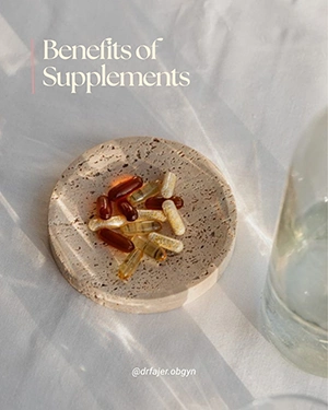
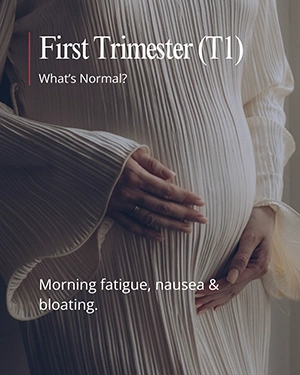
Informative Posts


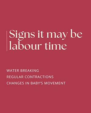
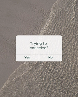
Creative Posts